
Color isn’t just about aesthetics—it influences mood, perception, and even decision-making. Whether you’re designing a website, painting a room, or curating a wardrobe, choosing the right color palette can mean the difference between a jarring mess and a visually pleasing masterpiece. The color wheel is the key to achieving that balance. It transforms color selection from guesswork into a structured, reliable process.
Understanding how colors interact helps prevent clashing hues that make designs feel disjointed. Instead, a well-planned color scheme creates unity, guides the eye, and evokes the desired emotions. Before diving into specific palettes, it’s important to grasp the basics of the color wheel and how different colors relate to one another.
The Basics of the Color Wheel
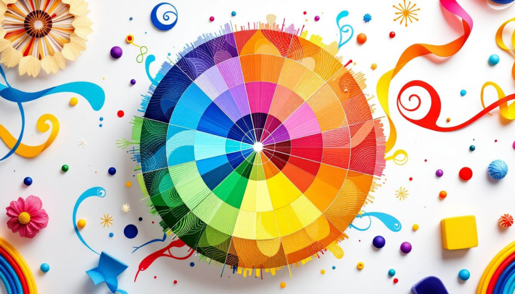
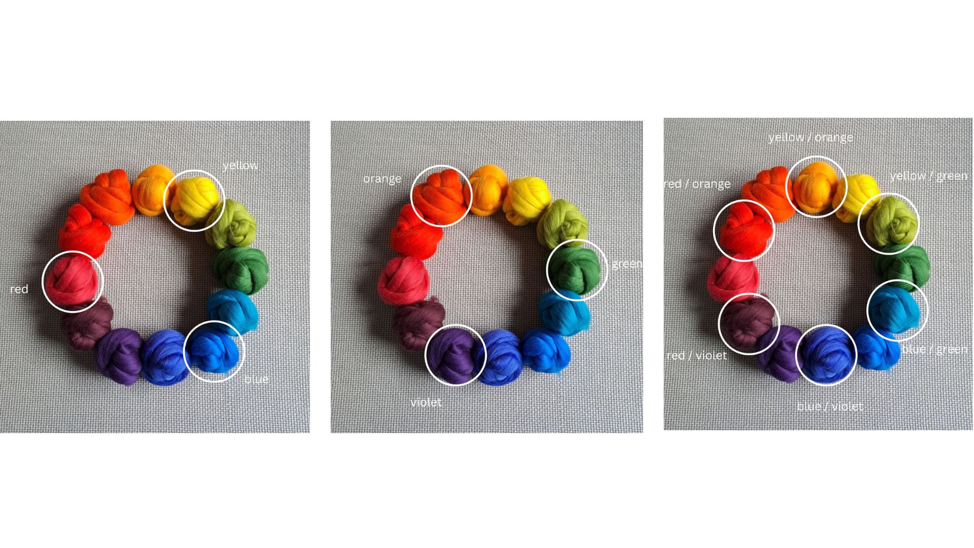
The color wheel is a visual representation of colors arranged according to their relationships. At its core, there are three primary colors—red, blue, and yellow—which cannot be created by mixing other colors. From these, we get the secondary colors—orange, green, and purple—formed by mixing two primary colors. Then, by combining primary and secondary colors, we get tertiary colors like red-orange or blue-green.
Beyond the basic hues, colors can be modified by adjusting their saturation (intensity) and value (lightness or darkness). These small tweaks allow for endless variations, ensuring that even within a structured palette, there’s plenty of room for creativity. For example, just as customizing colors can be a form of personal expression, many people also express themselves through clothing, such as by wearing veteran t-shirts.
Understanding Color Relationships
The true power of the color wheel lies in the relationships between colors. These relationships form the foundation for different types of color palettes:
Complementary Colors: Bold & High-Contrast
Complementary colors sit directly across from each other on the color wheel, such as blue and orange, red and green, or yellow and purple. This pairing creates a strong contrast, making both colors pop. Designers use this combination for high-energy looks that demand attention. Sports teams and fast-food chains frequently rely on complementary colors to make their branding more memorable.
However, this pairing can be overwhelming if used in equal proportions. A good rule of thumb is to let one color dominate while using the other as an accent.
Analogous Colors: Smooth & Harmonious
Analogous color schemes use three colors that sit next to each other on the wheel, such as blue, blue-green, and green. This approach creates a sense of unity and is often found in nature—think of a sunset with shades of red, orange, and yellow.
This palette is perfect for soothing, elegant designs, making it ideal for branding, fashion, and interior design. To keep it visually interesting, vary the saturation and brightness levels within the chosen hues.
Triadic Colors: Vibrant & Balanced
A triadic color scheme consists of three colors evenly spaced around the wheel, such as red, yellow, and blue or purple, green, and orange. This setup offers a mix of contrast and harmony, making it ideal for playful, energetic designs.
Because triadic palettes use three distinct hues, it’s crucial to balance the dominance of each color. Typically, one color takes the lead while the others serve as accents to avoid an overly chaotic look.
Split-Complementary Colors: Contrast with a Twist
For those who love the boldness of complementary colors but want a softer touch, split-complementary schemes are a great alternative. Instead of pairing two direct opposites, you take one color and pair it with the two colors adjacent to its complement. For example, instead of pairing red with green, you could use red with blue-green and yellow-green. Similarly, efficiency and balance can be achieved in finance through powerful tools like loan servicing software for private lenders.
This technique provides contrast without the stark tension of a direct complementary pair, making it more flexible and visually pleasing.
Monochromatic Colors: Subtle & Sophisticated
A monochromatic palette consists of different shades, tones, and tints of a single color. This method is excellent for creating a minimalist and elegant aesthetic. A blue monochromatic palette, for instance, can range from deep navy to sky blue, producing a soothing and cohesive feel.
The key to making a monochromatic scheme engaging is playing with texture and contrast. This prevents the design from looking too flat or monotonous.
How to Choose the Right Palette for Your Project
Selecting the right color scheme depends on the mood, purpose, and context of your design. Colors have psychological associations that can influence how a viewer feels or behaves. For those looking to maintain clean and professional spaces, deep concrete cleaning in St. Augustine, FL offers an effective solution for restoring surfaces to their best condition.
- For branding and marketing, consider the emotions you want to evoke. Blue conveys trust, red sparks excitement, and green suggests growth.
- For interior design, think about the atmosphere you want to create. Warm tones like yellow and orange feel cozy, while cool tones like blue and green are calming.
- For fashion, understanding undertones is crucial. Warm skin tones often pair well with earthy shades, while cool skin tones shine in jewel tones.
No matter the application, testing colors in different lighting conditions and contexts ensures they work well together.
Common Mistakes and How to Avoid Them
Even with a solid understanding of color theory, mistakes can happen. Here are some common pitfalls and how to avoid them:
Using Too Many Colors
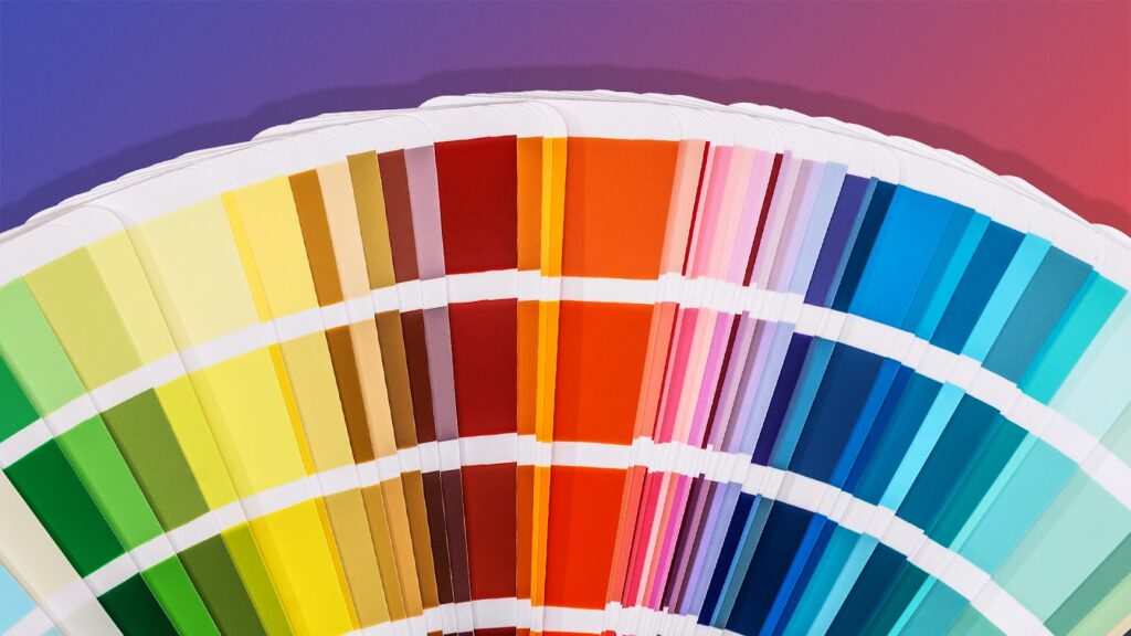
A cluttered palette can feel chaotic and unbalanced. Instead of overwhelming a design with too many hues, stick to a primary color and two or three supporting shades. This keeps the composition clean and intentional. If you find yourself drawn to multiple colors, consider using different tints (lighter versions), shades (darker versions), or tones (muted variations) of the same hues to create diversity without sacrificing cohesion. Additionally, using a neutral background can help bring together a colorful palette without making it feel overwhelming. When in doubt, refer back to the color wheel to ensure your choices still follow a recognizable scheme, whether it’s analogous, triadic, or complementary. For those seeking a relaxing outdoor activity, Lake Marion fishing offers a peaceful escape surrounded by nature.
Ignoring Contrast and Readability
In design and typography, contrast is essential for readability. Light text on a light background, or dark text on a dark background, makes content difficult to read. Aim for strong contrast—such as dark blue text on a pale yellow background—to ensure clarity. Contrast isn’t just about legibility; it also creates a visual hierarchy, helping viewers focus on the most important elements first. This is why call-to-action buttons on websites are often in bold, contrasting colors. If you’re unsure about the readability of your design, test it using grayscale mode or accessibility tools that evaluate contrast ratios to ensure your content is user-friendly for all audiences.
Neglecting the Role of Neutrals
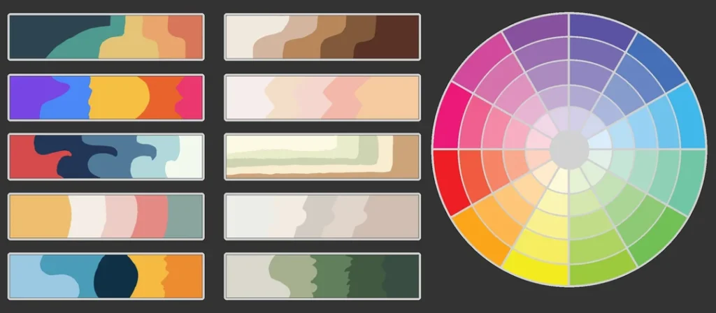
Neutrals like white, black, gray, and beige help balance bold colors. They act as breathing room in a design, preventing it from feeling too intense. Incorporating neutral tones ensures that vibrant hues don’t overwhelm the viewer. In interior design, for example, a room with bold-colored walls can feel much more balanced when paired with neutral furniture, rugs, and accents. In graphic design, backgrounds that are off-white or light gray can reduce eye strain and make brighter elements stand out more. Even in fashion, neutral tones like beige, navy, and black provide versatile, timeless options that anchor an outfit and allow accent colors to shine. For those seeking expert advice on aesthetic enhancement, Cheyanne Mallas offers valuable insights with her extensive experience in regenerative aesthetics.
Forgetting About Cultural and Emotional Associations
Colors have different meanings across cultures. While red symbolizes luck in China, it can signify danger in other regions. Understanding your audience’s cultural background and emotional responses to color is crucial when selecting a palette for a global audience. For example, white is associated with purity and weddings in Western cultures but is linked to mourning in some parts of Asia. Even within the same culture, shades of a color can carry different connotations—dark blue can feel corporate and professional, while sky blue feels relaxed and playful. Doing research on your target audience’s preferences ensures that your color choices enhance your message instead of unintentionally sending the wrong signal.
Bringing It All Together
Mastering color theory doesn’t mean following rigid rules—it’s about using the color wheel as a guide to create harmonious, effective designs. Whether you’re aiming for bold contrast or subtle elegance, understanding how colors interact allows you to make intentional, impactful choices.
A well-executed color scheme doesn’t just look appealing—it tells a story and evokes emotions. By carefully selecting colors based on the principles of contrast, harmony, and psychology, you can create a visual identity that resonates with your audience. It’s important to remember that trends come and go, but the foundations of color theory remain timeless.
The best way to refine your color-picking skills is through experimentation. Try different palettes, adjust shades, and observe how they change the mood of your design. Over time, you’ll develop an intuitive sense of what works—and your creations will go from clashing to cohesive with ease. Don’t be afraid to take risks and trust your instincts—color is meant to be played with! Whether designing a website, painting a room, or putting together an outfit, the right colors can elevate your project and bring your vision to life.